

UX Design Internship - Design Apartment Website
My Role: UX Designer
Responsibilities: Interaction Design, UI Design, Presenting to stakeholders
Work Setting: Sole Designer
Client: Kaer Holdings
Project Timeline: January 2022 - May 2022 (4 months)
Tools: Figma
Overview
What is Mystic Village Apartments?

Mystic Village Apartments is an apartment complex located in Mystic, Connecticut.

Current state screenshot
This is the sketch that the property management team was initially going to go with moving forward. Although the sketch of the homepage has most of what is expected and necessary features, the overall design does not follow most UX basic guidelines.
Problem
Why design a website for Mystic Village Apartments?
Mystic Village Apartments does not currently have a website that will attract new tenants.
In the future they would also like to add features such as making it easier for tenants to pay their rent.
Project Goal
Create a website design that attracts new tenants. When they go to the website, they should be able to immediately see the information and find exactly what they’re looking for very easily.
Initial Research

Competitors
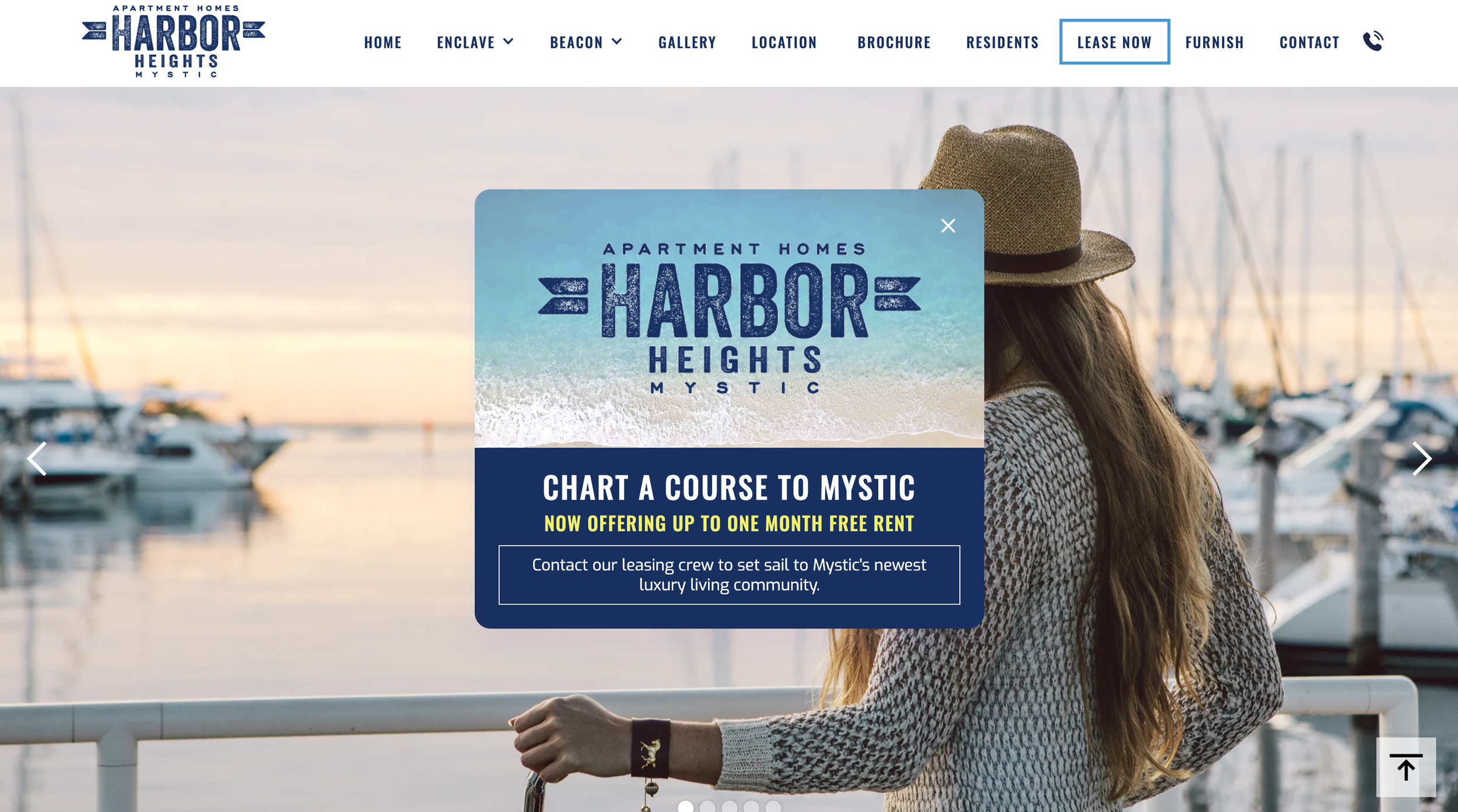
Harbor Heights: Homepage

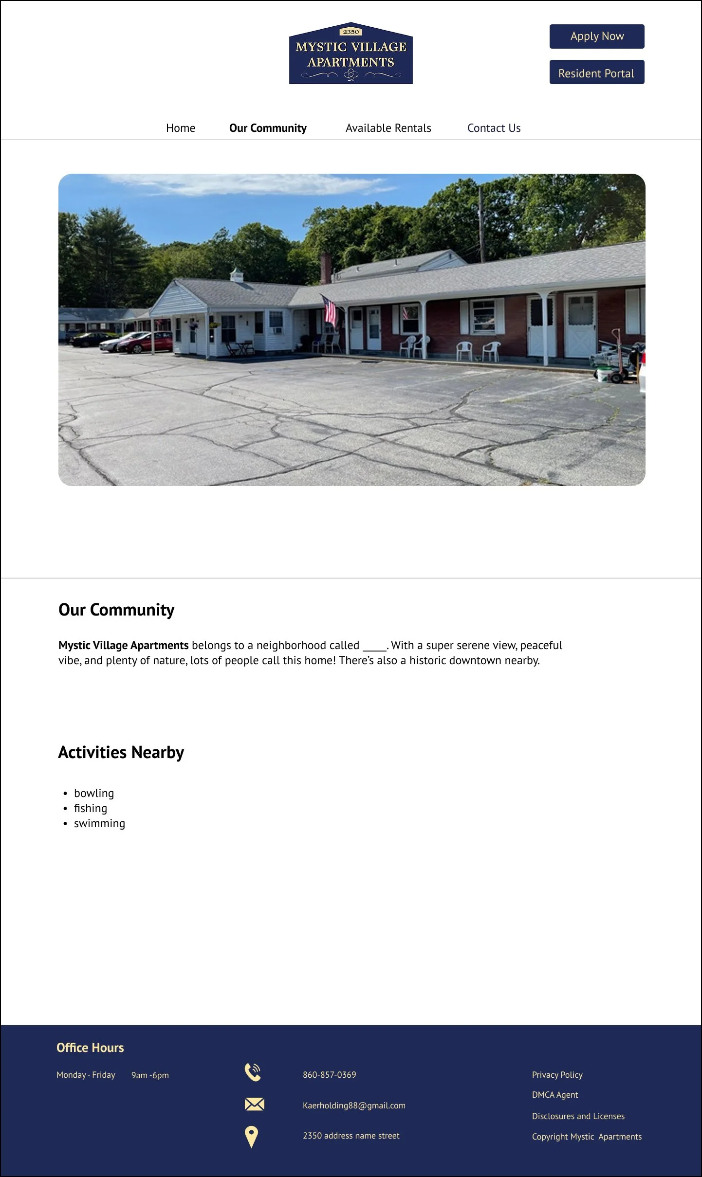
Harbor Heights: Location Page (About Mystic)
What are the most important factors that must be put on an apartment website?
What makes Mystic Village Apartments significant and unique compared to other apartment complexes?
Research Action items
Look at other apartment complex websites/ competitors and see similarities and differences between them.
Identify what is important and needed to include for the website:
Competitors’ strong points:
Strong first impression with a hero image or video showcasing the property.
Call-to-action (CTA) buttons like "Schedule a Tour," "Check Availability," or "Contact Us."
Local lifestyle highlights to showcase the neighborhood.
Demographic Profile
Mostly Adults 20s to 40s
Female and Male
Adults looking to find an Apartment complex in the area to rent
UX Requirements
What is needed to ensure the implementation of the redesign will enhance the user experience?
Must Have
Prominent Call-to-Action (CTA) (e.g., "Schedule a Tour," "Apply Now")
Easy-to-use menu with Floor Plans, Amenities, Gallery, Contact sections
Filters for different unit types (Studio, 1-Bed, 2-Bed, etc.)
Should Have
Answers to common questions about leasing, parking, pet policies, etc.
Embedded 3D virtual tours or video walkthroughs of units and amenities
Nice to Have
Allows users to compare different floor plans side by side
Automated chatbot or live chat for instant inquiries
Iterative Design & User Testing
Sketches
Wanted to make sure to include a big picture in the middle of the homepage with a carousel. And have the navigation tabs as what the client wants.


Iteration 1


User Testing
To make sure our design meets the needs and expectations of its target audience, we conducted our 1st round of user testing with 6 users who fit the following profile:
Age 25-60 years old
In the process of finding an apartment/ airbnb
This test was completed with the intent to gather qualitative data regarding:
Users’ navigational and functionality preferences when looking for leasing options.
Identifying the prototype’s areas of success and/or areas of opportunity
Main Findings
Overall people had a relatively positive reaction and response to the prototype and thought that it was easy to navigate.
80% of users mentioned that they really liked the minimalistic design as well.
Main recommendation from users was to have more icons and visuals on the website so it looks more appealing.


Feedback from Stakeholders
Before confirming which final design changes to move forward with, I presented our designs to the Software Engineer and Property Leasing Managers.
We held weekly meetings over Zoom to go over some of the design changes I made and confirm what to do moving forward. These were very helpful because sometimes ideas discussed in meetings look different on prototype mode and they would want to move in a different direction.
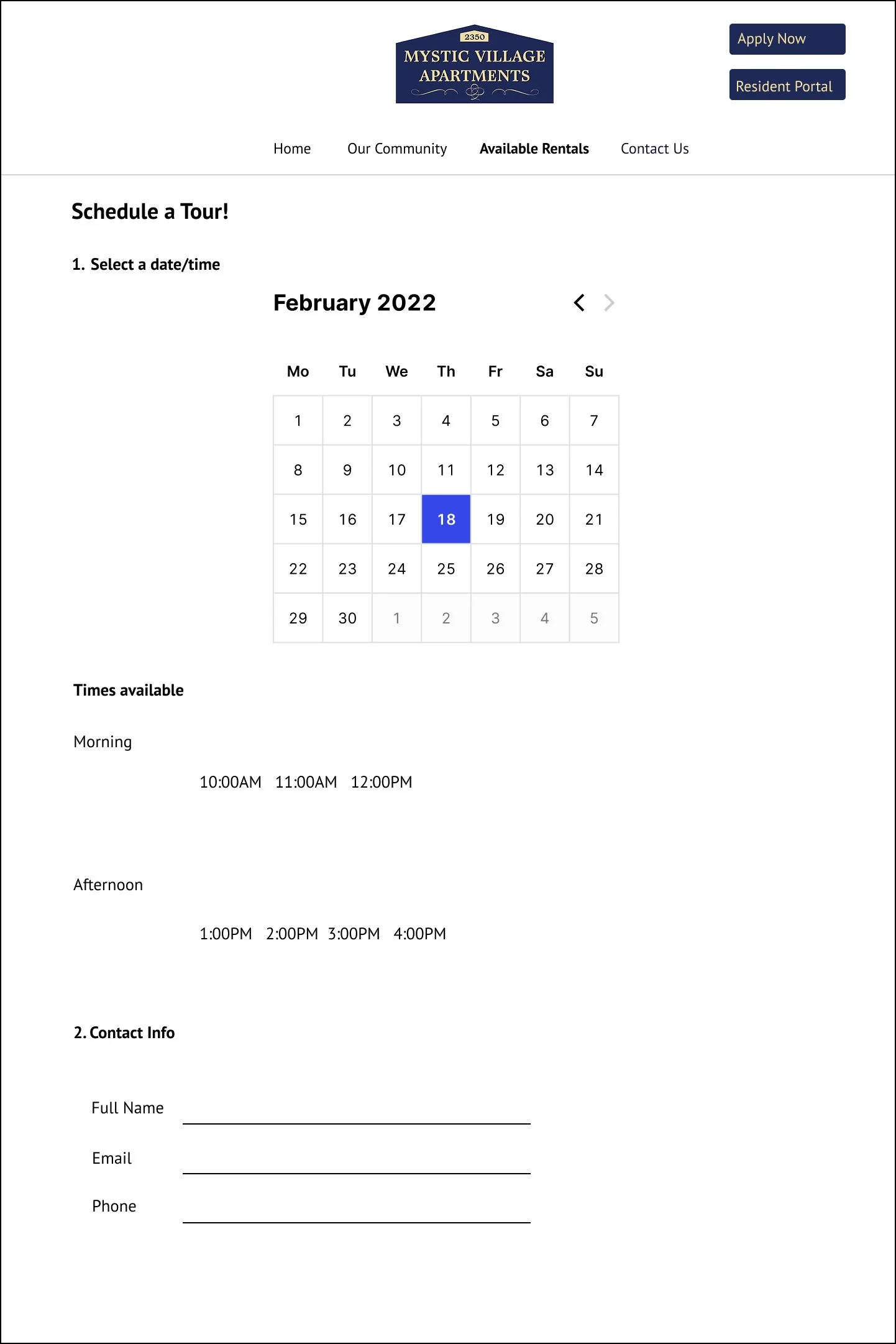
One of the things I had to change from the first iteration was the ‘Schedule a Tour’ feature with the calendar. The software engineer discussed with me that this feature was out of scope for the project, and that we could try to implement something like that in the future but that currently it would not be in scope for the website launch date. Although I was a bit disappointed that the design feature was out of scope, I knew that it was best to focus on the prioritized features and pages.
Key Takeaways
I realized that it was very important to have constant communication with the software engineer in the beginning, throughout, and towards the end of the project. I always knew this was important but during this project it proved to be essential in making sure the project would be finished in time. If I didn’t show the software engineer the ‘Schedule a Tour’ feature on my mockup, I probably would’ve made a full finished interactive prototype of that page just to show the engineer in the end and him let me know that it wasn’t in scope for the project. I’m very glad that I made sure to show him the mockups in the early stages before taking my time in making all the interactions and final touchups.